Filed under: Advertising & Branding | Tags: Branding, Consumer Packaged Goods, Contests, Culture, Customization, User Generated Content
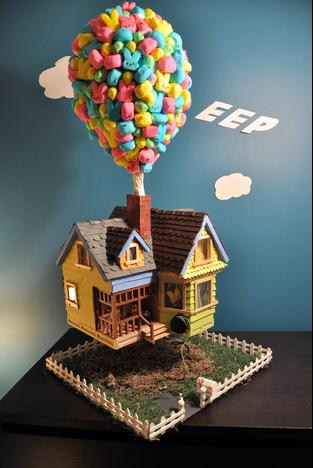
Just in time for Easter, Peeps is presenting its 4th annual diorama contest winners. This year’s winner, entitled “Eep,” modeled after last year’s Disney hit, Up!, and chosen from over a thousand entries, is exquisite–and the overall quality of entries has definitely gone up over the years.
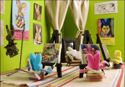
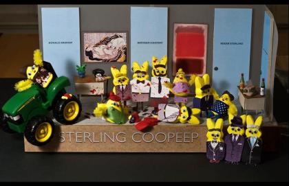
Ever-imaginative, these dioramas use the famous sugary animals (the bunnies are the most popular, but the chicks and bears make an appearance, too) to revamp culturally relevant events, icons, and ephemera–and you might be surprised how many, like this year’s winner, choose to depict some other branded entity. Here’s a couple of my favorites below, but definitely check out their other 35 top entries here.
Filed under: Advertising & Branding | Tags: Branding, Cause Marketing, Consumer Packaged Goods, Interactive, Media Arts, Out of Home/Ambient
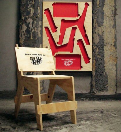
JWT for Kit Kat is on fire–but this time it’s Auckland, not Tokyo. In their latest, passersby in local parks are invited to take a break twice over–that is, break up a poster to take a break. The confectioner placed wooden posters at park entrances and in public spaces–posters that could be popped apart and assembled into the perfect bench for a (snack) break. (And it’s got to be intentional that the mode of assembly so closely parallels the way you would snap apart a Kit Kat bar–it’s too good not to be.) The poster is not only interactive–it’s useful–and it does a kindness while connecting simple pleasures with the “break” line Kit Kat’s been using for years.
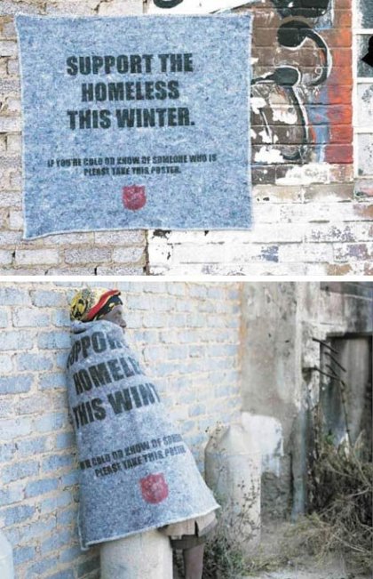
In the spirit of useful interactive posters, here’s one of my all-time favorites, from the Salvation Army, which posted blankets emblazoned with the words “Support the homeless this winter. If you’re cold or know of someone who is, please take this poster” in areas of need. Not only did these ads get the word out and even provide much-needed comfort to the homeless that began using them for warmth, but when the blankets were thus displayed, on the backs of those in need, the message became all the more starkly powerful. The absolute opposite of urban spam.
Filed under: Advertising & Branding | Tags: Branding, Cause Marketing, Consumer Packaged Goods, Media Arts, Out of Home/Ambient, Packaging
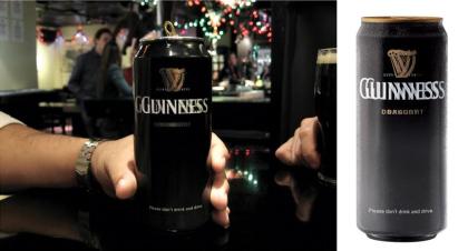
Happy St Patrick’s Day! In celebration, AdFreak brings us a cheeky-but-upstanding execution by St Pat’s staple, Guinness. In a 2007 effort by BBDO Toronto, the Irish brewers sent bars and pubs cans featuring blurry logo and type, each imprinted with a gentle reminder: “Please don’t drink and drive.” A clever, attention-getting call to responsibility in service of their “Enjoy Responsibly” campaign.
Filed under: Art & Design | Tags: Art, Consumer Packaged Goods, Culture, Installation, Interactive, Media Arts, Out of Home/Ambient
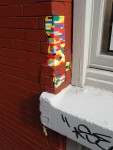
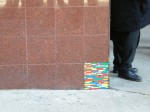
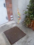
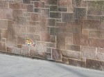
He’s done it all around the world–Amsterdam, Berlin, Quito, Tel Aviv, to name just a few cities–but artist Jan Vormann just brought his Lego patchwork installations stateside. Showing that Legos–and grassroots urban beautification–are for all ages, Vormann was joined by a volunteer team aged 3 to 40 that helped him renovate cracked and pitted buildings across New York City. The project was done as a part of the VOLTA art show, and took citizens’ initiative and immediate action to address buildings in need of repair–literally, unsightly “gaps in the urban landscape”–by applying playful patches of color that both highlight the problem and help fix it. (Incidentally, these Lego installations are conceptually similar to Pete Dungey’s British pothole gardens, which simultaneously draw attention to the problem of poorly-kept roads while providing a cheery quick-fix with the addition of flowerbeds to the roads’ many blemishes.)
Vormann’s installation goes along so well with Lego’s past “Build it,” “Rebuild it,” and “Build Together” campaigns it’s uncanny–you almost wish it were a branded installation, but ultimately it’s even better that it isn’t; it’s indicative of the cultural inroads Lego has made that it would be independently seized upon with such enthusiasm and for such on-brand purposes.
Filed under: Advertising & Branding | Tags: Branded Utility, Branding, Consumer Packaged Goods, Media Arts, Out of Home/Ambient, Stunt
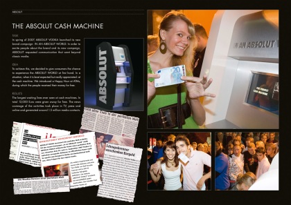
Absolut gave bar-hoppers a taste of what it’s like to live in an Absolut World when they set up Happy Hours at branded ATMs, which would dispense free money during the given period of time. This branding effort syncs with past efforts by agency K-MB, which sponsored free subway performances by famous comedians and published a newspaper titled Abolut World which only printed good news, and agency We Are Social’s Kindness As Currency executions against “in an Absolut World,” which included free coffee for a smile and free movie refreshments for compliments and high-fives, among other playful twists on our more dreary reality. The Absolut ATM, by agency TBWA\Berlin’s estimation, saw an expenditure of €12,000 in free cash generate an astounding 1.5 million media contacts, reaching audiences when they could use a break and turning up the buzz in the press.
There’s a bit of confusion in the blogosphere as to whether the machine doled out free money (as in a cash giveaway) or whether it simply was a fee-free ATM (I’m fairly certain it was the former), but either way, the point is made–in an Absolut world, things are just better. In fact, while the cash giveaway scenario is more dramatic, I actually like the fee-waiving ATM idea better precisely because it’s less outlandish and therefore somehow (to me at least) is a greater random-act-of-kindness gesture of goodwill. It’s also a better leverage of audience behavioral insights, recognizing a truth about the audience’s experience of a night out (running out of cash and having no choice but to pony up for exorbitant ATM fees at in-bar machines), and stepping in to provide a useful service at the right place and the right time, to make life easier and fairer–not to be a magnanimous mechanical rich uncle rewarding greed.
By turning a one-time stunt like free money giveaways into a branded utility like a fee-less ATM, Absolut could give this execution real legs: a fee-free ATM would have a more sustainable application in a bar setting as a fair and easy way for patrons to get money they might end up spending on Absolut, and as a way for grateful barkeeps to earn more money in exchange for a little high-traffic, contextually-relevant adspace.
Filed under: Advertising & Branding | Tags: Award-winning, Branding, Consumer Packaged Goods, Localization, Media Arts, Product
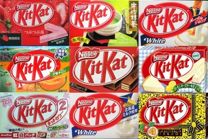
Anyone whose high school psychology teacher fed them an Australian musk-flavored Lifesaver and then laughed hysterically as they projectile-spat it out knows that there’s no accounting for (regional) taste. (If you’re curious, by the way, just soak a piece of chalk in cologne and pop it in your mouth.) Luckily, Kit Kat is offering a more palatable set of flavors tailored to several niche regional markets across Japan.
The brand, which is licensed to Hershey’s in the US but owned and operated by Nestle abroad, boasts 19 Japan-specific flavors like miso, soy sauce (the top-seller), green tea, and wasabi-white chocolate (as well as more sedate ones like strawberry cheesecake), and regularly adds new limited edition flavors to its carousel of localized palate-pleasers.
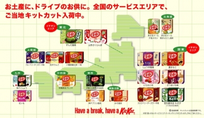
The genius of this product localization effort is that it is not only Japan-specific (no other market has regional flavors) but that it is region-specific within Japan–flavors are tailored to the peculiar palate of a given region, and are only offered in that specific location. For example, red potato Kit Kats available in Kyushu and yubari melon from Hokkaido cannot be purchased elsewhere in the country, spurring a collect-em-all frenzy (the specialty flavors, which began to roll out 3 years ago, are wildly popular) and making them tourist-worthy souvenirs for travelers from both abroad and at home–a fun way for Japanese consumers to discover, sample, and appreciate the multifaceted culinary culture and exotic regional fare of their own country. Many of the flavors are offered only for a limited time, with excess inventory being collected and distributed in “Happy Bag” grab-bags sold during major gift-giving holidays such as New Year, a move that both creates all-important hype as well as efficiently moves inventory.
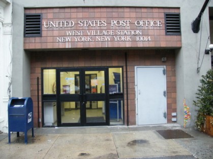
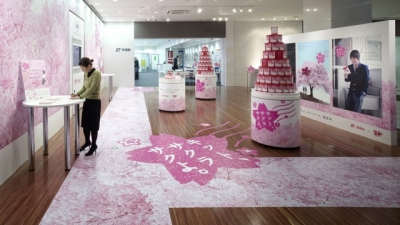
Thanks to the success of their regional flavors, Kit Kat is the #1 candy brand in Japan, and has become a cultural phenomenon. Adding to Kit Kat’s branding and sales success is yet another insight about the Japanese consumer base and culture: gift-giving is a big part of the Japanese culture, especially the practice of presenting students with good luck tokens before their all-important school entrance exams. In a fortuitous twist of phonetics, Kit Kat in Japan is sold as Kitto Katsu, which in Japanese means “surely win,” making it an excellent symbolic token (and delicious pre-exam pick-me-up) for this ritual. Kit Kat recognized the sales and product-as-medium branding opportunity and partnered with the recently-privatized Japanese postal service to create a special “Kit Kat Mail” postcard-like confection to be sent in the mail as an “edible good luck charm.” Kit Kat decorates post offices with Japan’s auspicious cherry blossoms during the annual exam period and sets up points of sale for Kit Kat Mail at each location–a brilliant choice as an uncluttered and competitor-less space. The execution not only boosted sales and allowed Kit Kat to become a natural part of a beloved cultural ritual, but also won agency JWT Tokyo the 2009 Media Grand Prix at the Cannes Lions.
Hear what the execs have to say–Advertising Age has the skinny on more of the strategic insights that led Nestle and JWT to their Kit Kat wins.
Filed under: Advertising & Branding | Tags: Branding, Consumer Packaged Goods, Direct, Media Arts, Movies/Film, Packaging, Tie-ins, TV
Almost all the brands advertising during the broadcast of Mad Men go for the same approximate strategy: demonstrate long brand heritage, show old-timey product shots of packaging changes over the years, maybe throw in some footage from vintage commercials, go retro retro retro, and ape the program’s throwback aesthetic and theme almost as if the show’s buttoned-up 60’s vibe is the only thing anyone who loves it cares about. I’m not saying they’re not fun, interesting, beautiful ads–in fact, kudos to BMW, Canada Dry, Clorox, et al. for tailoring the ads so well to their media placement–I’m just saying they all start to look the same one after the other, until you’re thinking, I get it, you’ve been around a long time. You’re hip to what this show’s about. Can we please get back to the story now?
I suppose I don’t envy them–trying to come up with clever, innovative branding to tie in on a show that revolves around clever, innovative branding is a lot of pressure. It’s hard not to be self conscious in that weirdly-meta creative environment, to be sure.
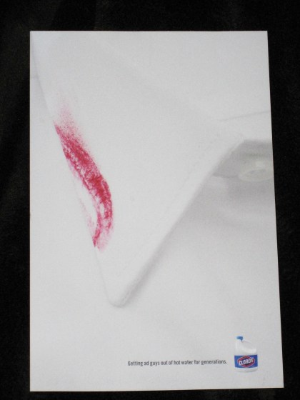
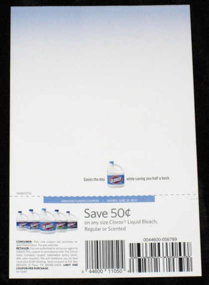
But Clorox rose to the occasion with their Season 2 Mad Men DVD insert. A simple single-sheeter tucked discreetly into the 3D shirt-box-lookalike DVD packaging (a tip of the hat to Mad Men’s consistently clever packaging team–the Season 1 DVD box, shaped like a Zippo lighter, was made of metal) featured an extreme closeup of a crisp white shirt collar like that on the outside of the box–except with a scandalous smear of lipstick, and the cheeky tagline “Getting ad guys out of hot water for generations”–a nod on the notorious womanizers of Mad Men. This simple execution managed to align the brand even better than before with the real reasons people love Mad Men, squeezing in a product benefit (and a little coupon on the back for all those desperate housewives…and househusbands?) while paying oblique homage to the characters and story that make the show great.
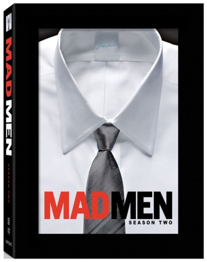
The Mad Men Season 2 box in which the insert came--the top part of the box had a clear cellophane pane just like a shirt box, and the box underneath had a shirt printed on it for a true 3D effect. The shirt's label cleverly reads "Menken's," after the department store owned by Don Draper's client-turned-secret-love
Filed under: Advertising & Branding | Tags: Branding, Consumer Packaged Goods, Media Arts, Out of Home/Ambient
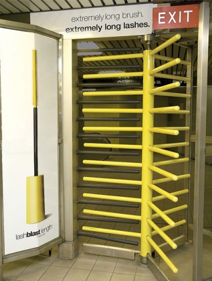
Media arts alert! Saatchi & Saatchi Canada went underground to find a great medium for Cover Girl LashBlast Length mascara, wrapping a subway turnstile in the mascara wand’s signature bright yellow, and the retaining bars in the black of long, well-coated lashes. Touting LashBlast Length’s “extremely long brush, extremely long lashes,” the execution makes clever and (almost too-) subtle use of the medium by providing a dramatization of the product and its benefits to the countless women who pass through it on a daily basis.
Filed under: Advertising & Branding | Tags: Branding, Consumer Packaged Goods, Media Arts, Web/Digital
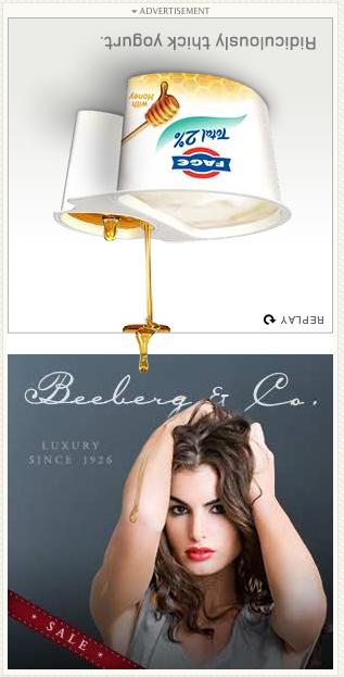
I was searching for recipes on Epicurious when I saw this nice banner–by Ogilvy New York– that interacts subtly with its surroundings. To demonstrate the “ridiculously thick,” rich texture of Fage yogurt, they inverted the banner ad, text and all–and it’s the notoriously viscous honey that drips out of the side-by-side cup, not the yogurt. Making it a bit more interesting is the fact that Fage placed a fake banner below theirs, for the honey to drip onto–you can see it pooling at the edge of the first banner and then running down the model’s arm in the cutesily-named Beeberg & Co. sale banner. A nice use of animation not just to grab attention, but to prove their point.
Watch a video of the banner in action:
Filed under: Advertising & Branding | Tags: Branding, Consumer Packaged Goods, Design, Media Arts, Packaging
A banana is a banana is a banana, right? Chiquita says no, and being perhaps the most recognizable brand in the space, thanks no doubt to its iconic blue-and-yellow stickers, it is in a position to do something about it. In a redesign aimed at making bananas playful, fun, and cool–and well, different–Chiquita designed 25 new attention-grabbing face stickers in the stalwart blue and yellow to turn instantly your average commoditized banana into an anthropomorphic potassium pod.
Recognizing that the little Chiquita sticker is the best branding asset at their disposal, the team sought to create bold and engaging personalities the bananas could take on through the stickers, and created a campaign around the notion “Don’t let another good banana go bad,” which in turn spawned an online hub that extends the brand experience through activities such as the Banana Boogie Battle game, in which fresh bananas do a dance-off against their spoiled and spotted counterparts, and “Banana Yo Face” in which users can create their own personalized sticker face from an assortment of features. It may not be getting people to voluntarily tattooo your brand name into their side (branding in the most literal sense–yuck), but the prospect of turning something as essentially mundane and functional as a product sticker into a brand artifact that entertains and in which people see value is pretty cool–when you think about it, it’s pretty absurd that someone would want to keep or share a brand sticker or a product tag, so if you’re actually connecting with audiences that way, more power to you.
View more images and read a great interview with DJ Neff of the design team here, in which Neff discusses how brand strengths, business insights, and audience behavior helped inform good design and effective branding. My favorite bit is in the brand equity section, which encapsulates the team’s media arts-savvy philosophy thusly: “When designing a brand for your product, make sure you know what party you are going to go to because what you wear speaks wonders about who you are.”
